The subtle meanings behind colour in branding, psychology & web design
20th Nov 20203 mins read
Share
Researchers have been studying the impact of colour in marketing and branding for a while, and surprisingly 90% of snap judgements made about products can be based on visual appearance and colour. With this in mind, it’s crucial to choose a colour which symbolises something relevant and represents your business on a whole.
As a general guide to how companies use colour psychology, this is what some colours say about brands or products:
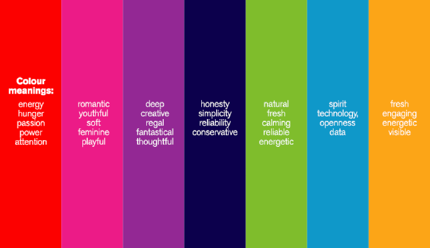
The meanings behind colour use in brands of the world. (Image credit boutiquemc.co.uk)
Red– evokes energy, hunger, passion, power, catches attention, often used for SALE signs and food Pink– romantic and youthful, often used to attract girls and young women Purple – deep, creative, regal, fantastical, thoughtful and more appetising than blue when used with food. Navy – honesty and simplicity, reliability, often used for banks, financial businesses and solicitors Black – sleek, used to promote luxury products Green– calming and reliable, energetic, signifies nature Blue– spirit, technology, openness, data, very popular in software and online technology Orange– not as strong as red, good practical and simple, high visibility, a good secondary call to action colour, think food and hardware stores also
Once you’ve figured out your company colours and the meaning you wish to convey behind them, it’s time to translate this to the website design. There is a lot to consider when deciding on a website’s colour scheme. Here’s a mini guide:
Pick colours that suit your demographic
We’re not just talking about age range and social status here (although that is important). You also need to base decisions on where in the world your visitors will be. Are you selling worldwide or just in Australia? Colours can have different cultural and social connotations so be careful to check up on these in your target countries. For example, white in certain contexts can symbolise death and mourning in China so might not be a good choice – always check whether your branding design is culturally insensitive in other markets.
Next you can think about age groups and demographics. Younger generations may be drawn to bright colours and patterns, whereas the more mature demographic would probably see this as garish and be put off, presuming the brand wasn’t for them. Decide exactly who it is you want to impress.
Background, Accent, Text, Links
Using a colour scheme means being consistent but making sure everything has a different colour which compliments all the others. You’ll need to choose a background colour which says something about your brand, the text colour needs to be clear and easy to read. Call to action buttons should have a bold, attention grabbing block colour. Reds, greens and oranges tend to work here but you can use any colour depending on the context of your buttons and the rest of your website colours.
We hope you found this article useful & that it helps your website design process in some way.
Need a hand with your website or brand? Talk to Bapple UX Agency