In a world increasingly dominated by digital experiences, web accessibility has become more critical than ever. It’s not just about creating user-friendly websites; it’s about making the digital world inclusive for everyone. But what exactly is web accessibility, and why should it matter to you beyond the digital realm? Join us on a journey to explore the profound impact of accessibility, learn about the difference between accessibility and usability, discover tools to test contrast ratios, and see real-life examples of accessible design.
The Unseen Struggles: Accessibility vs. Usability
Accessibility and usability are closely related but distinct concepts. While usability focuses on making products and interfaces easy to use for everyone, accessibility goes further by ensuring that those with disabilities can use them without barriers. But accessibility doesn’t just benefit those with disabilities; it enhances the user experience for everyone.
Now that we’ve distinguished between accessibility and usability, it’s time to delve into the guardians of web standards and practices: the Web Content Accessibility Guidelines (WCAG).
These guidelines serve as the beacon for recognising, maintaining, and ensuring online accessibility. In Australia for instance, the Disability Discrimination Act of 1992 advises that at least all government agencies adhere to WCAG 2.0, emphasising the importance of inclusivity in the digital space.
The Pillars of Web Accessibility: WCAG’s 4 Principles
At the heart of WCAG lies a set of four fundamental principles, each with its own guidelines, success criteria, and techniques. These principles form the backbone of accessible web design, ensuring that all online content is:
- Perceivable: WCAG’s first principle emphasises that digital content should be perceivable by all users, regardless of their abilities. This means that information and user interface components must be presented in a way that can be discerned by all, whether through sight, hearing, or other sensory channels.
- Operable: The operability principle places accessibility in the hands of users, stressing that web content should be operable by various means. It ensures that individuals can navigate and interact with digital interfaces using a keyboard, mouse, or other input devices, making the web a place where everyone can participate.
- Understandable: Understanding web content should be a universal experience. WCAG’s third principle dictates that digital interfaces must be designed in a way that is clear, intuitive, and easy to comprehend. It focuses on logical navigation, concise language, and predictable interactions, eliminating confusion for all users.
- Robust: Robustness is the foundation for the future of web accessibility. This principle advocates for content that is resilient, adaptable, and compatible with a diverse array of user agents and assistive technologies. It ensures that web content remains accessible as technology evolves.
Throughout this article, we will illuminate these principles with real-world examples that showcase their presence or absence. From websites and applications to everyday experiences, we’ll explore how these principles manifest and the impact they have on accessibility.
Seeing the World Differently: The Power of Colour
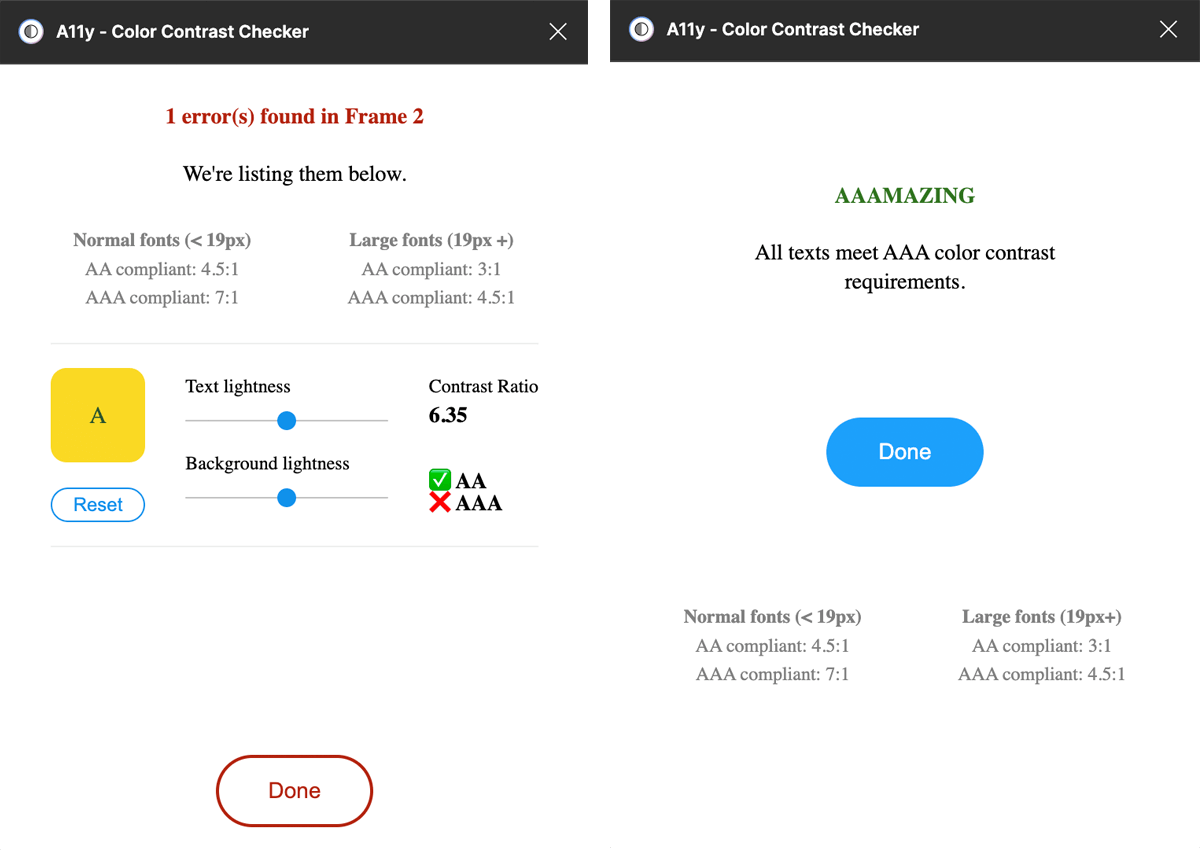
We live in a world where accessibility is not limited to the web. It extends to our everyday activities, like navigating through airports, hospitals, and even your local park. Did you know that 1 in 12 men and 1 in 200 women report suffering from colour blindness? (Albany-Ward, 2015) This condition can lead to subtle yet significant challenges in everyday life, such as struggling to differentiate traffic lights. Web designers need to consider these users when choosing colour schemes and ensuring adequate colour contrast for readability.
Steering Clear of Common Mistakes: The ‘Click Here’ Blunder
Many designers unknowingly hinder accessibility by using vague link text like “Click Here” or “Learn More.” This lack of descriptive context can be confusing for screen reader users, where the link label is divorced from the supporting content. Instead, provide meaningful link text that gives users a clear idea of where the link will take them in isolation from other content. Here is a great example of how Lucy, a blind content creator inspires and informs her followers about her day to day life as a blind smartphone user.
– [Link to video of a blind person using a phone.]
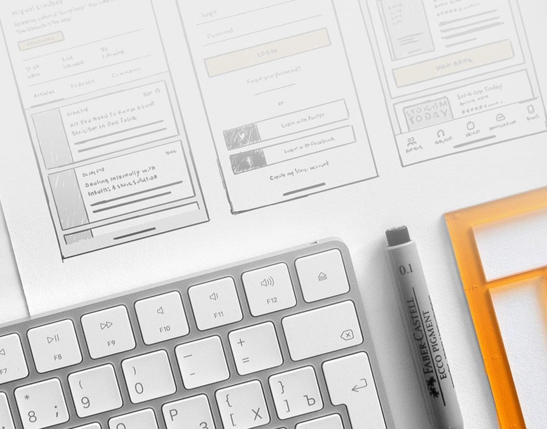
Designing for Accessibility: The Bapple Way
Bapple doesn’t just talk the talk; we’ve developed a comprehensive design system for creating low-fidelity wireframes that adhere to WCAG guidelines. As an example, this system includes button designs that prioritise accessibility, making it easy for designers to create inclusive interfaces where a button has a minimum 44x44px size and 8px margin.

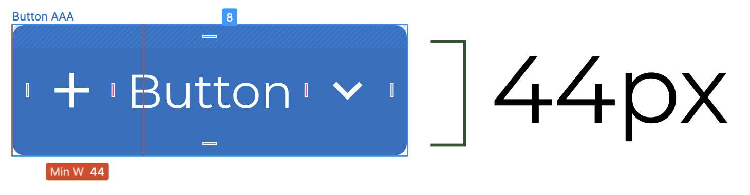
You might wonder why it’s so important to have a minimum button size or why WCAG is going out of its way to stop you from using those great pastel colours you had planned for your portfolio. Imagine a customer is keen on contacting you through your website, but can’t find the contact page, is not able to press the submit button since their thumbs are bigger than the margins you set out or they simply aren’t able to read your wonderful success stories with clients because the contrast of your text and background was too low.